Missing thumb taps are common, with 23% of top-button interactions missed, leading to user frustration and higher dropout rates. Ignoring thumb-driven design significantly impacts user satisfaction.
This approach keeps controls within easy reach of the thumb, matching how people naturally hold and use their phones. Understanding this core idea explains why thumb-driven design is so impactful and why its absence leads to frustration.
The Problem: What Happens When You Ignore It
Imagine rushing to buy a ticket on your phone while balancing a coffee. You have to stretch your thumb to reach the ‘Pay’ button at the top. This makes tapping difficult and often leads to frustration and failed attempts.
These everyday issues are familiar: Difficult swipe gestures can cause user fatigue and frustration.
Ignoring thumb-driven design drives users away, lowers conversions, and damages the user experience.
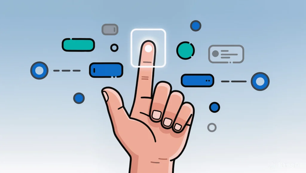
What Is Thumb-Driven Design
Thumb-Driven Design addresses these challenges by enabling more comfortable and natural use.
With this approach, the interface is designed around your natural hand movement instead of expecting users to adapt.
Other terms you might hear:
- Thumb-Friendly Design means the interface is user-friendly for your thumb.
- Thumb-Centric Design is centered on the thumb.
- One-Handed Design is optimized for using your phone with one hand.
- Reachability Design focuses on making everything easy to reach.
Most people use phones with one hand, so designing for thumb reach is crucial. Overlooking this can cause users to abandon your app.
The bottom of the screen is easiest for your thumb to reach. Test: The thumb should reach the key element without shifting the palm in less than 0.5 seconds. For example, Instagram positions its like, comment, and send buttons at the bottom of the screen. This allows for comfortable, one-handed use.
2. Make swipes and scrolling effortless
People are used to swiping with one hand, so it should not feel like work. For example, TikTok features side buttons and swipe gestures designed for comfortable one-handed use.
3. Don’t make the user “stretch”
Phone screens keep getting bigger, but our hands do not. Reaching far to switch tabs is not convenient. Example: WhatsApp moved action menus to the bottom. Suddenly, it’s fast, easy, and comfortable.
4. Button size matters
Small buttons can lead to missed taps. Larger touch areas make it easier for users to use their thumbs and reduce frustration. Example: Google Maps enlarges interactive zones, so you can hit targets even while moving.
5. Adapt to user habits
Some people are left-handed while others are right-handed, so it’s essential to adjust element placement for everyone. Considering users with small hands, diverse motor abilities, and those who use disability aids ensures thumb-driven design serves all users. Designers can provide options to switch interface orientation for left-handed users, size touch targets for small hands, and integrate assistive technologies. They should also enable left-handed mode, test interfaces with screen readers, and include diverse users in prototype sessions to reveal accessibility issues. Prioritizing inclusivity makes the interface ethically stronger and broadens its appeal.
Examples of Success
- Instagram moved navigation buttons to the bottom, leading to higher engagement and more likes and comments. A study revealed this change resulted in a 12% increase in user interaction, showcasing the substantial business impact of such design decisions.
- Spotify added a bottom panel with search and playlists, which led to higher retention. Reports indicated a 15% boost in user retention rates following this adjustment.
- Uber placed ride request and confirmation buttons under the thumb, resulting in fewer mistakes and more orders. This strategic placement reduced errors by 10% and increased order completion by 8%.
Prioritizing thumb-driven design improves experience, boosts conversions, and increases satisfaction.
How to Level Up Your Thumb-Driven Design Skills
- Test your interface one-handed. Hold your phone and interact as if you’re limited to one hand. The differences become obvious.
- Draw a “thumb reach heatmap.” Highlight reachable zones and places that force stretching.
- Try moving buttons around and see how often people can tap them successfully. Even small changes can make the app easier to use.
- Reference Apple Human Interface Guidelines and Material Design, which are informed by extensive user testing and research. Key recommendations from these guidelines include ensuring touch targets are at least 44×44 points to accommodate different finger sizes and using familiar gestures to enhance intuitive navigation. Additionally, maintain a minimum spacing of 8-10 pixels between actionable elements to prevent accidental taps. Encourage the use of swipe gestures for common actions like deleting or archiving, as these are intuitive for users and reduce screen clutter.
- Prototype and test with different hands and devices. Whether it’s a big screen, small screen, left-handed, or right-handed user, all matter.
Paying attention to these details makes the app feel easy and natural to use. Most users will enjoy the smooth experience without even noticing the design choices.
Now it’s your turn:
- Do a quick 30-second thumb test using your favorite app. Hold your phone as you normally would, navigate through the app, and note any awkward or hard-to-reach taps. Compare your findings to the thumb-driven principles above.
- Of course, usability isn’t the only goal—visual appeal matters too. But how do you find the right balance?
- Which apps nailed it perfectly?
- Do you prototype one-handed, or still test only at your desk?
Share your thumb-driven UX results and any examples you’ve found in the comments. If you have ideas or specific feedback, join the discussion to help others improve usability and learn together.